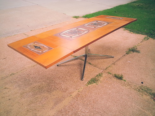
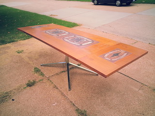
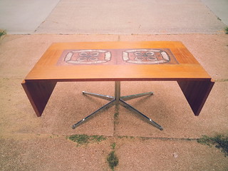
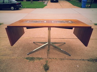
I picked up the Florence Knoll base with half of a (LARGE) walnut conference table top. Unfortunately, since it was just half a top, there is a full edge that is unfinished. That top isn't marked Knoll either, so I don't even know if it was original. I kicked around the idea of cutting that top down to a desk size but then I found this!
I've always loved these Teak and Tile drop leaf dining tables but have rarely found one that had a
cool looking base. The base always looked like an after thought compared to the top. Those amazing
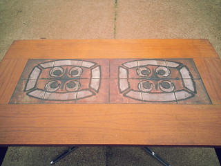
tiles are a hard act to follow. So when I found one of these tables for a very reasonable price on
craigslist yesterday I thought "Perfect!" I can totally marry those to each other. It'll look smashing.
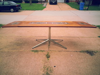
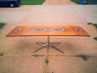
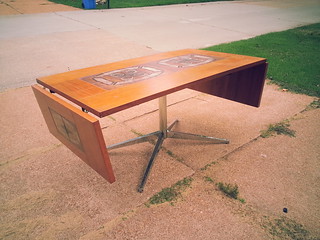
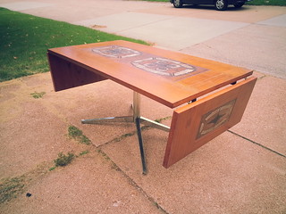
And it does. They look, to my eye, like they were made for each other. I mean, with the drop leaves
up this is about the size of a small conference table...much like what many of the Florence Knoll
bases were attached to. With them down, it's the perfect size for a personal desk. Or, as the top was
originally intended, this is a nice space saving flexible dining table. I probably should have shot a pic
of it, but the drop leaves can be taken off completely as well, making for a small four / six person
dining table.
But I can't shake the feeling that I'm committing some sort of vintage modern sin by cobbling these
tow disparate pieces together. Am I welding the front of a motorcycle to the back of a Volkswagen
Bug? Just because one can accomplish something, doesn't mean it should be done.
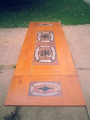
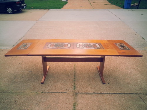
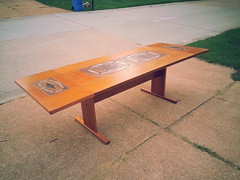
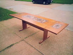
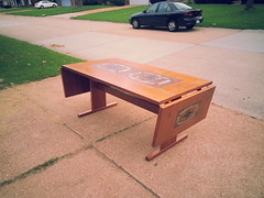
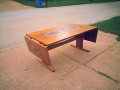
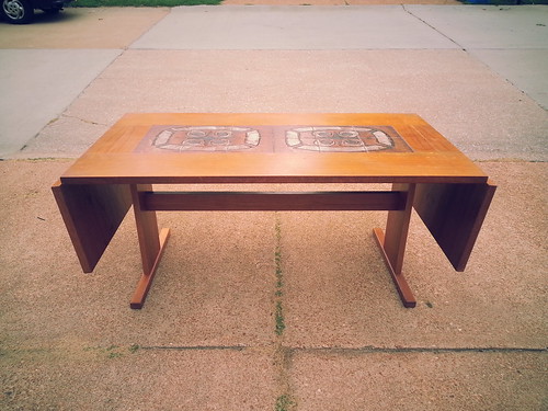
Just for comparison, here's what the original base looks like on the table. It's nothing special. It's not
solid teak either (though nether is the top...though nether is an original Knoll walnut top!). This was
prabably a flat pack "some assembly required" table back in the '70s. I wish I knew more about the
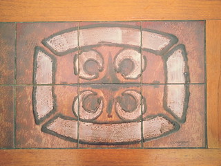
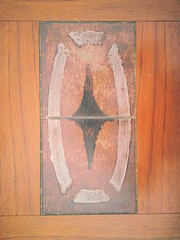
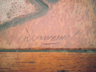
Tile Art done on these tables. This set is signed although I can't really make it out. As soon as I get
some room in one booth or another I'll be dropping this Frankensteined piece off for your personal
perusal and judgement. Let me know what ya think: Hot or Not?

I actually prefer the original base.
ReplyDeleteI think the Knoll looks undersized for the new tabletop. I'd keep it on the original base and keep looking for the right top for the Knoll.
ReplyDeleteIt’s good, MMT. I saw a lot of these tile ‘n teak tables in Danish furniture stores a number of years ago. They always looked good to me but like your other reader that commented they preferred the original base, I do too. I think it’s the chrome that makes me agree. - midmichigan
ReplyDeleteI, too, prefer the original trestle base. From the pictures it appears that the Knoll base would interfere with foot and chair space. Save the Knoll until you find the perfect top for it. - Minnesota
ReplyDeleteWow, huh...
ReplyDeleteI did not expect this, but it looks like the nays are carrying the day.
I guess I'll just clean it up and offer it as found with a nice set of Erik Buck dining chairs.
I agree with the others; I think the proportions are better with the original base!
ReplyDeleteorig base. knoll too tippy for size of this table
ReplyDeleteOriginal base. The other one hurts my face.
ReplyDelete